Showing posts with label palette. Show all posts

Thursday, July 3, 2014

Step by Step… watercolor

I'm sooo excited to be doing a series of blog posts about this 
fun, fun, loosey, goosey outta control process of watercolor!
Frequently, I've been asked about my process...
the paint I use, the palette, my signature block 
and…. most often, how I get my colors.

 What better place to share then here!
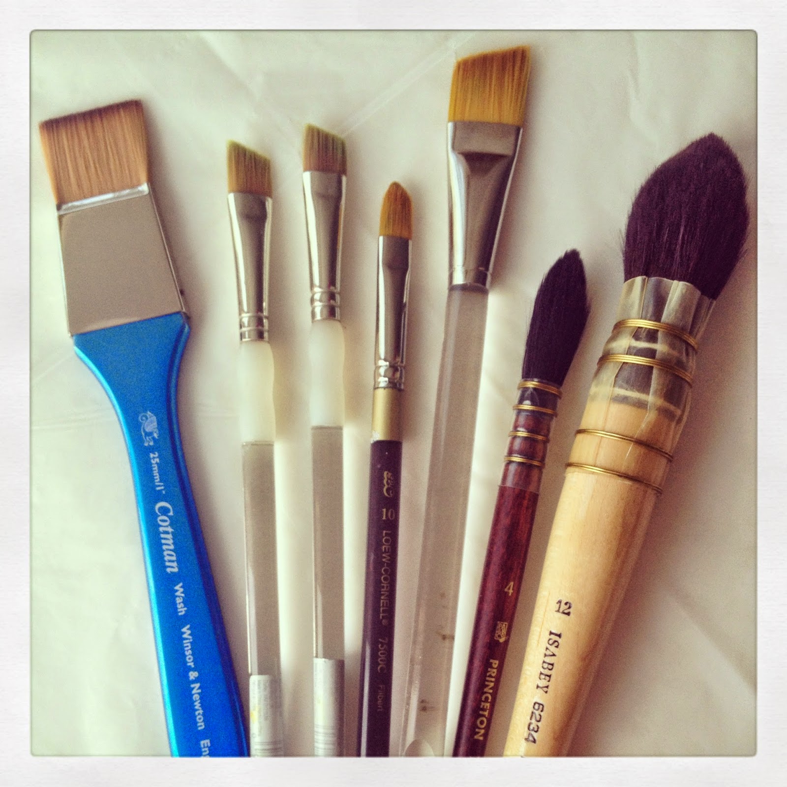
Above is a selection of brushes that I use on a regular basis.
There are a couple of pricey brushes here, as well as a few inexpensive ones. 
I am a big proponent for trying different supplies to find what feels best to you... 
In my experience… I generally see, that quality 
does matter with those end results.

From left to right: 
Cotman square wash 1"
Royal & Langnickel (2 of them) 1/2" angle
Loew-Cornell #10 filbert
Windsor & Newton 1" angle
Princeton Neptune #4 quill 
Isabey #12 Squirrel Mop 
all watercolor brushes…

In a nutshell… the square brush is for making background washes, 
and strands of color.
The two angle brushes are cheaper brushes that I use for most of my small sketches. 
I love the shape, as it allows for a thick or thin stroke. 
They are great for glazing colors. 
Because they are inexpensive… I usually keep a few on hand.
The filbert brush is great for smaller work too. 
It feels good to use on curved shapes and smaller solid areas.
The 1" angle serves the same purpose as the smaller brushes, 
just covering a larger surface.
And lastly… the quill and mop brush allow for loading up of water & color 
 to achieve a loose wash, or free form shape, 
or mingling of color…
whatever your fancy.

For anyone that likes more detailed info about brushes, 
their content, shape and purpose...
I've included a couple of helpful links below.          

and… the palette...
and… the paint...

My paints are a selection of Holbein and Windsor & Newton 
with an occasion random tube thrown in.
I think I found a couple of Yarka brand 
(really dated paint that I've had for a long long time) 
and a few Sennelier in my repertoire. 
For the most part 
I am a Holbein-Windsor & Newton kind of chick.
I tend to like Holbein brand a lot, 
because they are more saturated and brilliant in color. 

Holbein Artists' Watercolors are imported from Japan. 
Holbein's colors are known for their brilliance, 
with clean and crisp characteristics. 
Their content is designed in a way, that makes them 
ideal for preserving brushstrokes 
and color vigor over long periods of time.

The Windsor & Newton's are my standard, base… welcome home… 
I'm here for you paints.
They are known for their incredible quality and permanence as well.
Between the two, I've found the flexibility to make some luscious colors.
Definitely check out the new Windsor & Newton website
It's chock full of art supply information, 
as well as ways to connect with community
and share in the artists gallery.
I've been asked many times about my palette color choices.
Funny… I know it looks like I'm ready for a refill on the one above...
but I'd be remiss in not mentioning how long these colors last.
I love using this small palette for sketching 
I have a large palettes with big wells, for larger paintings.
This is one of my favorites for watercolor sketching right now.
The pages take layering of color… "glazing"... pretty well for a sketchbook. 
You can definitely see that the paper is substantial with a nice tooth for grabbing the color.
I have yet to try the Zeta series which is a smoother sheet.
And for the finale…Drum roll please…
my palette colors….
lemon yellow (H)
cadmium yellow(WN)
cadmium red orange (H)
windsor orange (WN)
cadmium red deep (H)
quinacridone gold (WN)
burnt sienna (H)
yellow ochre (H)
alizarin crimson (WN)
rose madder (H)
quinacridone magenta (WN)
prussian blue (H)
indigo (WN)
mineral violet (H)
cobalt blue (WN)
leaf green (H)
paynes grey (H)
permanent violet (H)
viridian (WN)
turquoise blue (H)
cobalt turquoise light (WN)
permanent green (H)
terre verte (H)
and a few extras… lilac, brilliant pink, lavender, cobalt violet light all (H)
a little sketch… a little water… and a beginning layer of wash starts the process.
I'll be breaking down the steps 
on how I do a color-FULL veggie sketch on the next post.

I hope this has been helpful! 
haPPy summer sketching!


Check back if you're interested… 
or join this blog site by signing up on google connect. 
(to sign up- see connect block in left column.)


Tuesday, June 17, 2014

Watercolor time...


Some days I find I am writing more than painting. 
Who knew? 
Some days I find I am building my website more than painting… 
Who knew?
Some days I find I am tending to others needs more than painting…
Who knew?
This path of growing an art life will always be riddled with stops and go's...
making that time spent painting 
so much more appreciated.

So with those moments…
I've been working in my S&B sketchbook painting a series of veggies. 

This time of year, brings back memories of summers 
on the east end of Long Island…
where a farm stand resides
on many a small town road.
Fresh strawberries abound, for making jam.  
and..veggies brighter than the sky, 
delight the eye with their homegrown goodness.
I got to thinking about my affinity for painting elements 
from different seasons…
the flowers of spring, fruits & veggies of summer, the leaves of fall… 
and the flowery greens of winter. 

I find myself returning to them, just like home.
In the wake of developing this little series...
I've been getting tons of questions and requests regarding my palette, 
my process, the brands I use, the glazing, the calligraphic words, 
and my little signature block.

I've decided to do a series here to provide answers to those questions.
Woo hoo! Went through a dry spell with words,
and now have an array of informative posts planned for you all. 
If you have any specific questions about my process, 
feel free to leave a note in the comment section.
I'll be posting once a week…
starting with my palette and brands of paint.

Grateful for all of your artsy support friends!


Friday, June 21, 2013

Palettes of color....


"I think palettes 
are a glimpse 
into the soul 
of a painter. 

Yep, you're going to heaven."
~Brian Schnetzer 
(friend extraordinaire)

When I posted a photo of my watercolor palette on facebook recently, 
one of my dearest friend's 
left the words above on my page.
I was so touched...
(well, he's that kind of person- one of those rare & cherished friends)
...he gave me cause to think...
our palette says a lot about who we are 
and how we approach our work.

If you've been on this blog space of a journey with me ... 
you are probably well aware of 
my affinity to 
w a t e r  C O L O R. 
(with an emphasis on the color part.)

 So many sweet friends have been asking about what colors I use, 
what type of paint, how etc. 
I thought it might be fun to start sharing some posts 
on the "how to's of what I do's".
I kind of see myself as a "rebel" when it comes to following (NOT) 
hard core "tradition" in watercolor. 
The very essence of the medium, evokes freedom and lack of control...
which is probably why I love it so. 
I am always learning lessons on 
 l e t t i n g   g o
a n d
t r u s t i n g,
when I create with watercolor.

Upon taking a deeper look at my palette, 
I noticed that I didn't have all of my colors lined up exactly 
with warm and cool colors in their proper place. 
I tend to put random bursts of color 
"outside of the box"
so to speak.
I also noticed that a lot of times, those random bursts of color 
are used in my work, as that color gem- that little sparkle added to the page.
Wow, there's more to your palette when you start to really look at it.
It's kind of a metaphor for how I like to create
and live my creative life.
What paint?? I am asked often...
I like a combination of Holbein & Windsor Newton brand.
You can see from my journal book pages 
that I am a big fan of wet on wet and glazing techniques.
I believe those techniques, allow me to achieve a lot of depth, 
as well as an organic feel to my work.

The "pear and lavendar" spread above, is from one of my journal books-
inspired by all that I learned from Wild Art classes with Junelle Jacobsen.
I am sooo in love with journal pages...
as it allows the freedom to explore and create 
for a larger work.
Tomorrow starts a "new session" of Wild Art  called 

I'm feeling like a little kid... so looking forward to creating new projects, 
and connecting with an incredible group of people.
If you like the idea of creating in a journal, exploring with watercolor 
and so much more... 
I would highly recommend signing up for Junelle's class. 
It starts tomorrow, but is a go at your own pace online e-course.
It's most inspiring for those who like to
"color out of the lines"... like me.

photo above: Junelle Jacobsen's wild art class
What colors are on your palette?
In my next post, I'll share a little on how I go about painting with glazes 
using my "out of the box" color palette.
Hope to see you in the Wild ART Summer group. 

Related Posts Plugin for WordPress, Blogger...